10 Questions With… Jonah Markowitz, Production Designer For HBO’s New Crime Thriller
When it comes to production design, the most vibrant kind of world-building is that which creates places that feel at once accurate and effortless, the kind of world you recognize but that also feels brand-new. Few do period design with the kind of panache production designer Jonah Markowitz brings to his projects, which range from impressionistic biopics like Mapplethorpe and George & Tammy to this summer’s HBO crime thriller Duster. Created by J.J. Abrams and LaToya Morgan, the show tells the story of the first Black woman agent (Rachel Hilson), who unravels governmental conspiracy with a little help from her getaway driver (Josh Holloway) and the titular vehicle.
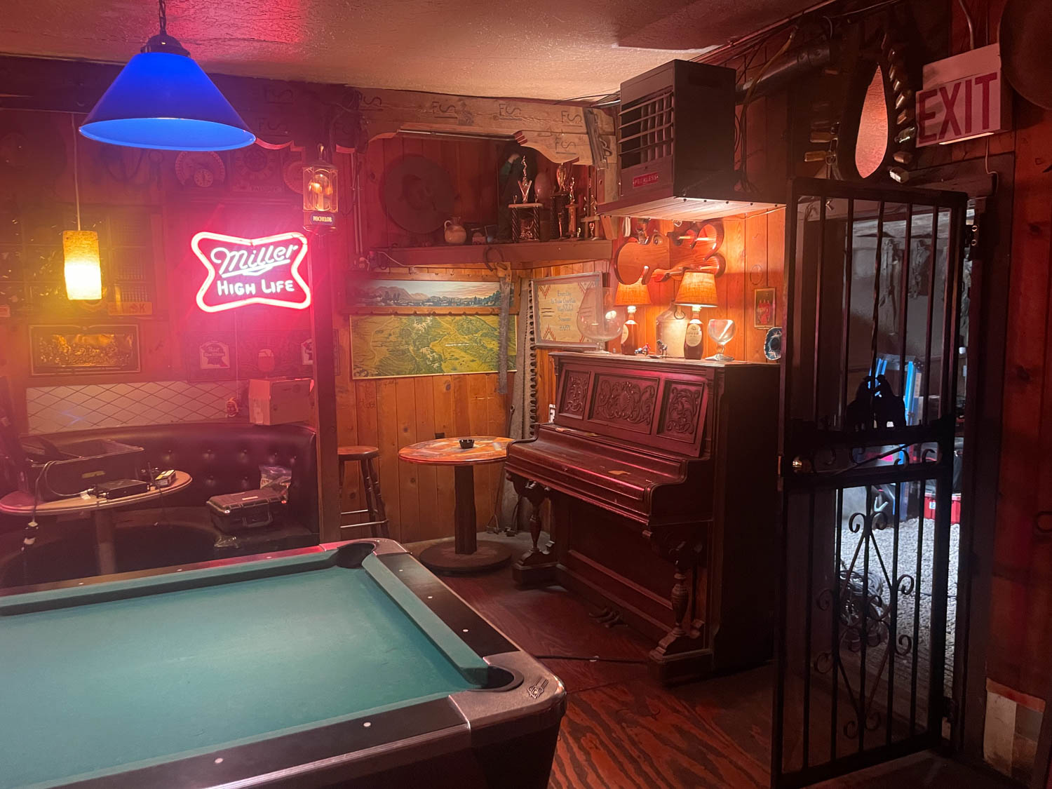
Markowitz let Interior Design into the passenger seat for a conversation about his love for Labyrinth, how color palettes tell stories, and resisting cliché—and shared some behind-the-scenes photos of his work.
Editor’s note: This interview has been edited and condensed for clarity.
How Jonah Markowitz Paints Stories With Technicolor
Interior Design: Could you tell me a little about your childhood?
Jonah Markowitz: I grew up in Colorado, and while there wasn’t a flourishing arts scene there in the late ‘70s and early 80s, both of my grandparents were painters, and my mom owned a gallery and went on later to curate a museum. I remember asking a neighbor if he “grew up with art in the house” and he replied by asking me who “Art” was. My dad was a huge movie buff, and we went to movies every weekend.
ID: What did you see?
JM: Things like ET (which I saw eight times), Indiana Jones, Labyrinth, and The Never Ending Story. These huge worlds that totally enveloped me were my first taste of world-building. They had fantastic set pieces that were such a part of the story. I really remember those handcrafted, beautiful sets. In high school and then in film school at Emerson College, I discovered quieter, design-forward works such as The Piano, Queen Margot, Safe, and The Storm—films that showed me that intimacy could be as cinematic as spectacle. These sets were stages, places where you not only learned about a character through their surroundings but also a place that affected how that character presented in each scene: ambitious, trapped, free, restrained, confident.
ID: How did you get into the business?
JM: In film school, I would direct but also often design friends’ and classmates’ films. My first internship was at Konrad Pictures, a production company owned and run by Kathy Conrad and James Mangold. Within a few weeks, they asked if I would come on as a full-time employee. One of the executives I worked for invited me to a barbecue where I met my first mentor, designer Tom Meyer. He interviewed me and a few weeks later, I became a PA for a film he was art directing called Crazy/Beautiful. From there, I gradually worked up to doing graphic design for him on the Russo Brothers’s Welcome to Colinwood, before art-directing Blue Crush and We Are Marshall. I stayed with Tom for many years before I started designing on my own. The first feature film I designed was Quinceañera, and that became a calling card for future projects.
ID: You’ve worked on a number of projects that touch on the 1970s. Is there something about that period in which you’re particularly interested?
JM: It’s such a visual time, but it’s also so misrepresented; it’s fun and challenging to correct that. We’ve come to expect design that references film, TV, and pop culture more than actually researching what things were like, and then creating sets that give them a stage to act on and a visual feast for the audience. This comes into play when you are doing a project that is based on real people.
Keeping it authentic means centering design decisions on choices that honor the character. This means not only approaching a space as if it was designed to look great by a decorator the same year the movie took place, but also peeling back the layers of where the things came from: Did they save up to buy this? Inherit it? Do they tolerate it because their spouse likes it? Do they not even notice it’s there? You have to be a bit of an archaeologist, psychologist, and interior designer to pull these types of sets and stories off.
ID: In the case of a film like Mapplethorpe, how do you build a world that feels like his own work as a visual artist could have come out of it?
JM: The movie spanned four decades, and I wanted each to feel like the different parts of his life. I always start with a palette, and so I built a different palette for each of the decades. In the ‘60s, when he was at Pratt, it had a lot of earth tones. He was in the military and hadn’t developed his creative style yet. As he moved into the street world and the Chelsea Hotel, the palette changed, inspired by the street art that was happening. We introduced yellows and blacks, referencing artists who were inspirations to him, like Basquiat and Warhol. As we moved into the ‘80s, and he became recognized for his photography, we drained the palette into a monochromatic black-and-white, to show how the trappings of success and fame aren’t always the most colorful—and also that was when the AIDS crisis hit his community, and him personally, so restraining the color helped tell that story.
But I wanted to also show the vibrant art scene, the lavish lofts that were the stage on which this work was created, to really put the audience in the artist’s perspective. When you’re doing period work, you’re always doing a balance of stylization and verisimilitude. We had a trove of research, but that doesn’t mean we recreated every vase he collected. If you lean too far into the artifice, you eclipse the actors. If you lean too far into historical accuracy, it turns into a documentary that’s wooden and boring. As a designer, from the moment you pitch somebody all the way through final execution, you’re walking that fine line.
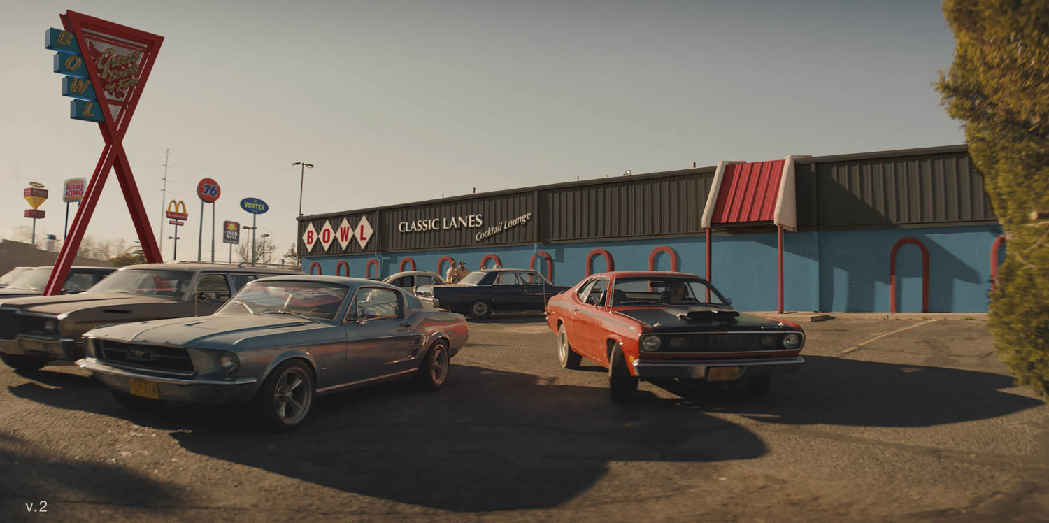
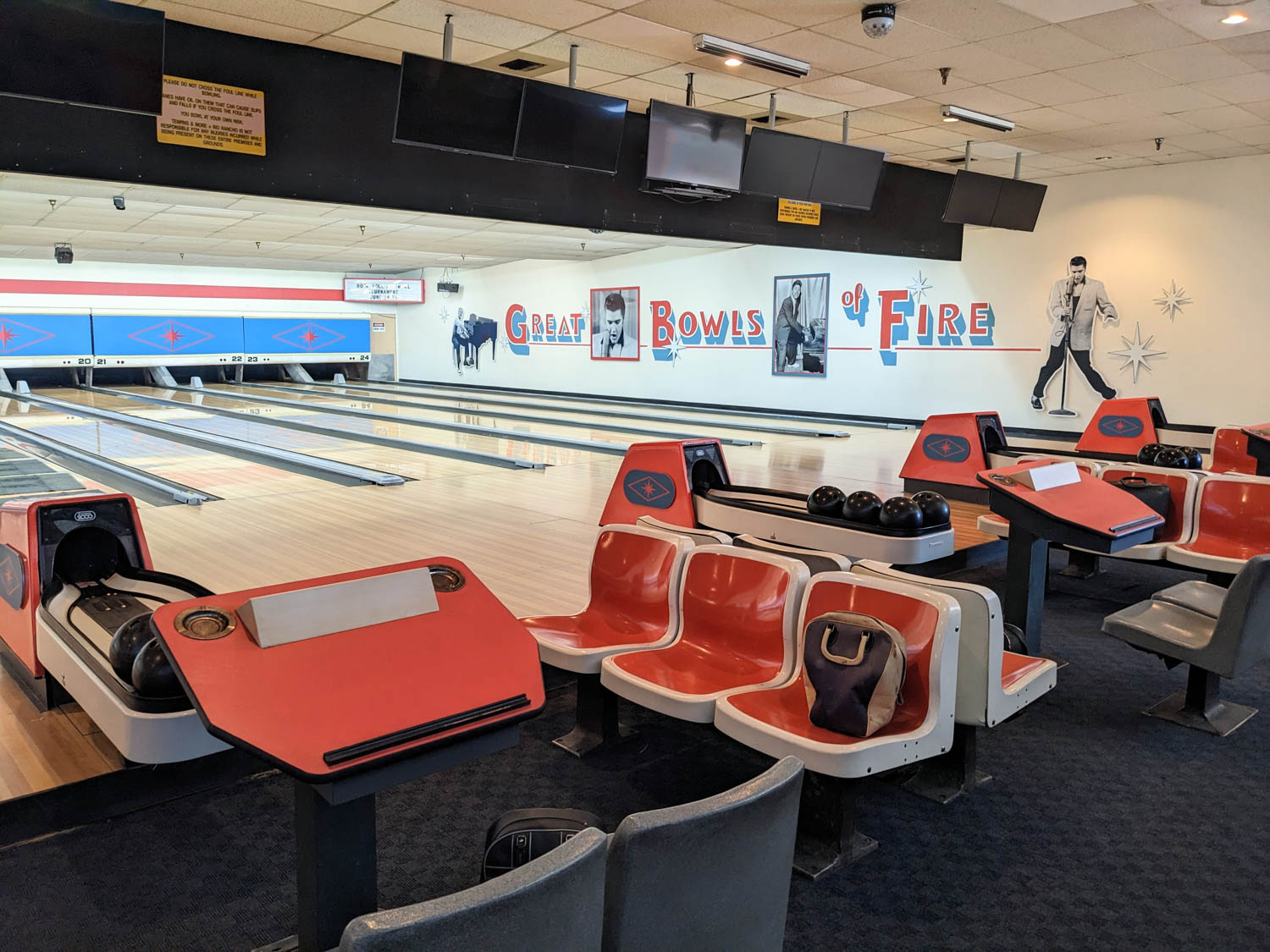
ID: There are some 100 sets in Duster. How do you keep them consistent, but identifiable on their own terms?
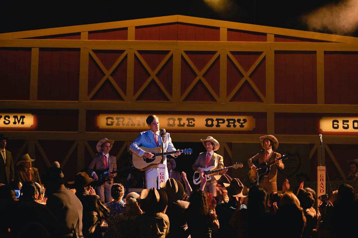
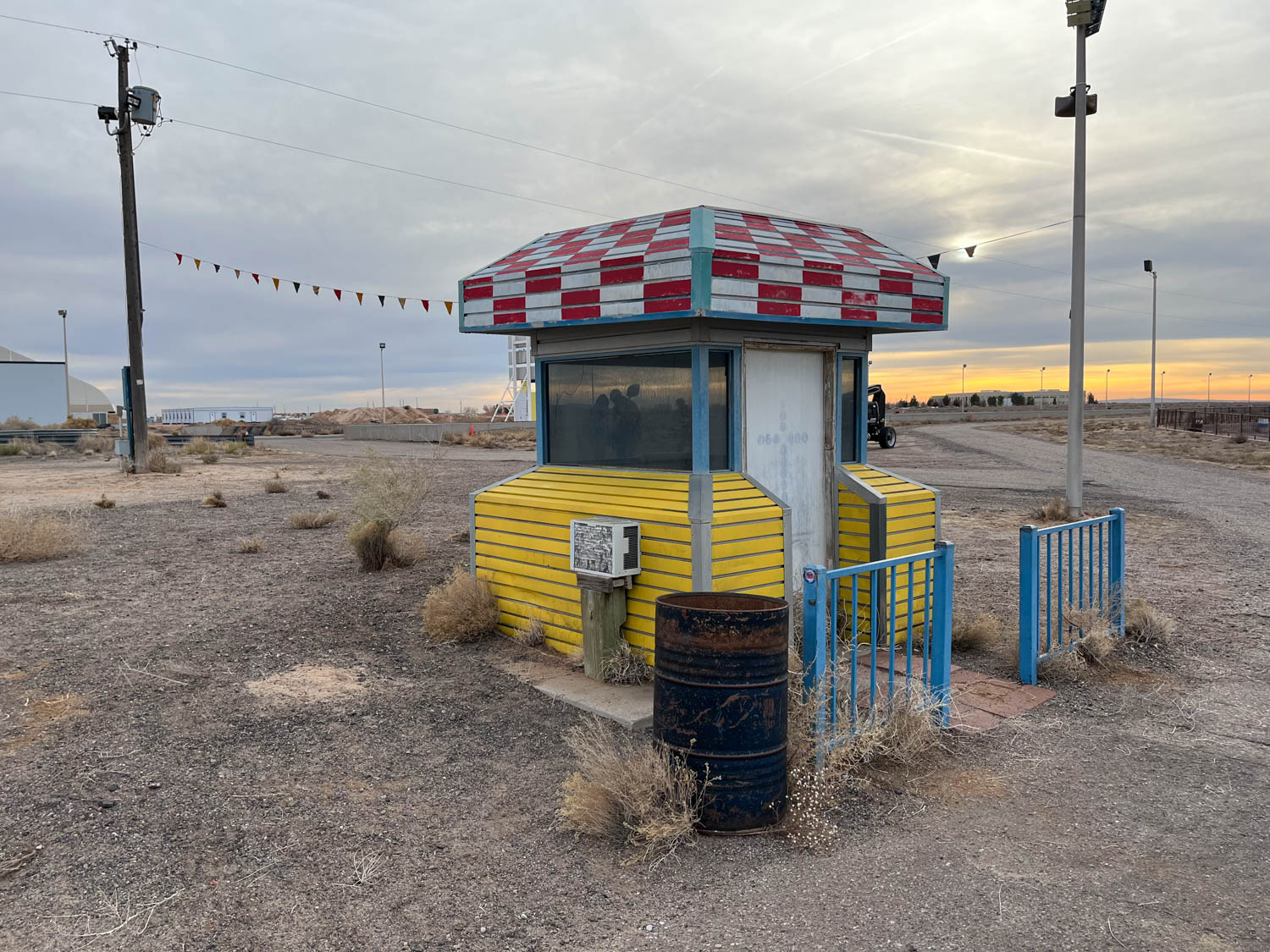
JM: I go right to the palette. I was very interested in the idea of motion as a character and design principle. We’re on the road constantly—moving. The first image J.J. had in his mind was this cherry red Duster zipping up to a payphone in the middle of the desert in the American Southwest. So, I started looking at the Americana photography of legends of the road, such as Stephen Shore, William Eggleston, Joel Sternfeld, and Garry Winogrand. I started seeing this whole world that wasn’t the secondary colors we’re used to seeing in the ‘70s. It was garish, at first. A lot of photographs only had primary colors. The image I led with was a blue car with a red taillight and the yellow lines on a black road with yellow and red cliffs on both sides.
I pitched a completely primary color palette, which was definitely a swing, as it’s hard not to just picture a kindergarten or playground. But it made this incredible, rich, unique take. And it kept the sets all in the same world. We did no secondary colors, no greens or oranges or browns or all those nostalgic collective memories of the palette. We also dipped a little bit into more ‘60s colors and textures, because when doing period you realize that sometimes you need to back up ten, twenty, even thirty or forty years with textiles and props to make a set feel authentic.
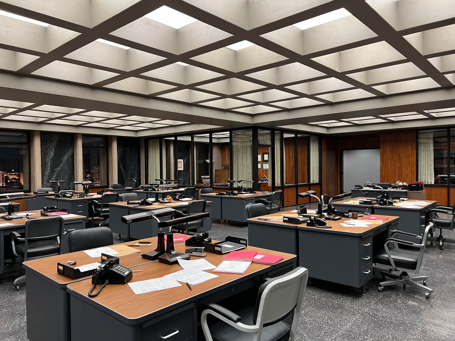
ID: Could you tell me a little about the design for Duster’s FBI headquarters?
JM: We’ve collectively watched so many movies with police offices that have long hallways, linoleum floors, fluorescent lights, and beige filing cabinets. I wanted to do something different. The office is also where Nina Hayes, our protagonist, works as one of the first African-American FBI agents. From the moment she walks through the door, all eyes are on her. So I set a challenge: What if this office had no hallways and no traditional closed-door rooms? I wanted to create a large, open-floor plan, with a central glass-walled conference room at its heart.
The idea was to build something that functioned like a fishbowl, a space where Nina was constantly being watched, and never able to work privately. We constructed the central conference room using wooden louvers that could be rotated to almost—but not quite—create privacy. The rest of the office was arranged around that nucleus. We steered away from all the typical finishes and leaned into richer, more elegant textures—black marble, wood grain, indoor plants. We installed a coffered ceiling with nearly 300 individually programmable lights, so we could shape the mood of every scene—day, night, or even isolating Nina under a spotlight as she worked alone.
One consequence of that design was that we ended up with nearly 200 feet of windows on two sides of the set, which meant we had to build a custom translight, a massive printed backing that could be front- or back-lit to simulate the cityscape at different times of day. Because the story is set in 1972 Phoenix, we couldn’t just grab stock images. We had to start from scratch. So, we sent a team of about ten people to Phoenix to capture panoramic rooftop views of the city and surrounding hills. Then the real work began: We had to digitally remove all the modern buildings, reconstruct the historical skyline, and—in some cases—piece together what would’ve been behind now-demolished structures. It ended up the most intricate backings I’ve ever built. The process that took nearly four months.
ID: How do you avoid cliché when designing for periods that are so visually familiar?
JM: While a few sets required us to fully embrace 1972, many others called for interpretation and nuance. So, whenever I read a description of a location that calls for a “groovy ’70s bar with wallpaper and lava lamps,” and I feel it could be a missed opportunity, I look for an alternative or ask if there’s another direction the director or creator might be open to that might help us tell the story better. Very often, these descriptions are more of a placeholder than a fully realized idea, and collaborators are quite open to new takes. In those cases, I might suggest: What if this space was originally a jazz bar from the ’40s, or an inherited speakeasy that can more inform their character? These questions open the door to specificity. And specificity always wins over cliché.
ID: Duster will probably be mostly seen via streaming. Do you have to approach set design differently knowing it might be watched on phones, tablets, or laptops, instead of bigger screens?
JM: Having such a strong, graphic color palette makes a show like Duster really pop, even on a small screen. I started in feature films, which I only would see when they were finished, projected on a huge screen. Now we’ve gone to, of course, all of us watching dailies—and, many times, even the final product of our own work—on a small screen. So, subconsciously, I think I am probably designing more for that. But I’m not sure if I quite have the answer of how, yet.
ID: What’s next for you?
JM: I’m currently working in Manitoba shooting a new adaptation of Little House on the Prairie for Netflix. So I’ve gone from 1972 Arizona to 1869 Kansas. We’ve swapped out our muscle cars for covered wagons, discos and bowling alleys for hotels and homesteads. And again, I’m always keeping an eye on resisting clichés and learning a lot in the process about things that didn’t exist in the Wild West, like the classic saloon swinging doors we all expect, the colorful wagons, and more. I still aim to dig into research that doesn’t echo other films or familiar representations.
Instead of just pulling reference images, I’m reading letters, studying books, and looking at paintings, all building a visual language that may not be exactly what we’ve seen on screen before for this time period. I’m still walking the line between stylization and verisimilitude, trying to create something that feels authentic yet engaging and not just a re-styling of past interpretations. This is a new period to create for me, and I’m really enjoying it. I’m also co-designing this series with my husband for the first time. He’s more of a classical interior designer from Spain, and our collaboration has been incredibly rewarding. Together, we are not only helping shape a distinct look for the show, but we’re creating a vision of the period that will feel both new and nostalgic to audiences. It’s both a big challenge and a lot of fun.
read more
DesignWire
Parador Explores Design Legacy and Global Growth on SURROUND Presents
Tune into this SURROUND Presents episode to learn how Parador is evolving its global presence through sustainability and design-led approach.
DesignWire
Sculptural Drama Steals the Spotlight in This St Vincents Show
From an anthropomorphic candle holder to a golden credenza, see how Nick Valentijn’s debut show at St Vincents celebrates sculptural expression.